
Bushido: Rebrand %Arabica
For this school project, we were tasked with creating a complete branding and spatial retail design solution for %Arabica’s new coffee shop opening at the Culver City Platform in Los Angeles.
Branding
Creative Direction
Crafting smooth journeys from vision to reality, ensuring every detail aligns with the brand’s heartbeat.®
Bushido: The Way of Coffee
The core challenge was to adapt %Arabica’s minimalist Japanese identity, ensuring it not only resonated with the culturally diverse, design-forward, and fast-paced environment of Culver City, LA, but also embraced and amplified its Japanese roots. While the global brand is synonymous with understated elegance, the LA audience demanded something bolder—an edgy, design-driven approach that reflects the city's dynamic creativity and multicultural energy.
Diving deep into challenges to opportunities
%Arabica needed a rebrand that preserved its premium craftsmanship while creating a more daring, culturally enriched, and hyper-local retail experience. The goal was to establish a space that celebrates Japan’s bold design traditions—combining precision, artistry, and mindfulness—with a modern twist. This new identity needed to elevate the coffee experience, creating a sanctuary that invites creativity, community, and connection in LA’s design-conscious and diverse market.


Willow Studio was created to redefine the way brands communicate through design. Our approach blends creativity, strategy, and functionality to deliver visually stunning and highly effective solutions. We focus on crafting seamless user experiences, ensuring that every design element serves a purpose and enhances brand storytelling. By combining cutting-edge aesthetics with thoughtful execution, we help businesses stand out in a crowded market. From branding and digital experiences to interactive design and storytelling, Willow Studio provides a tailored approach that aligns with each client’s unique vision. Our process prioritizes collaboration, ensuring that every project is a perfect fusion of creativity and business goals.

Audience: Urban Samurai
Sophisticated. Discerning. Mindful.
The Urban Samurai are not just coffee drinkers—they are seekers of meaning and craft. These modern warriors embrace the spirit of excellence in their daily lives, craving spaces where they can pause, reflect, and connect.
Mindful Consumption: They savor each sip, appreciating the craft and origin of their coffee.
Community-Driven: They thrive in environments that foster creativity and connection.
Bold & Edgy: They seek spaces and brands that are distinct, culturally rich, and
unapologetically authentic.


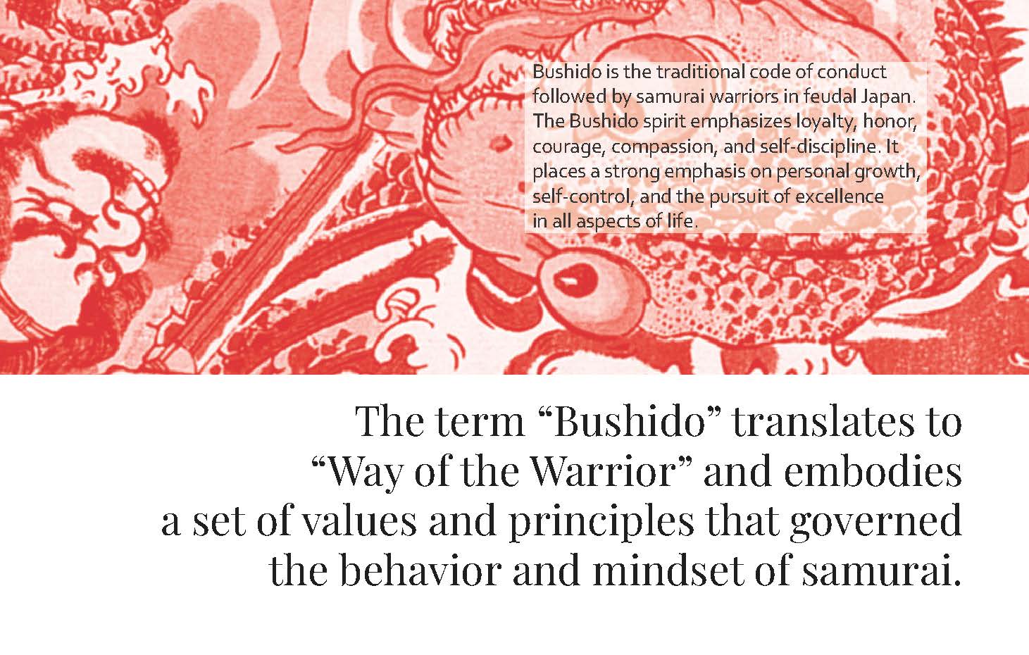
The Spirit of BUSHIDO
Drawing from the philosophy of the samurai, %Arabica embodies:
Mastery & Discipline: Relentless pursuit of excellence in every detail.
Mindfulness & Respect: Deep appreciation for the craft of coffee
and its cultural significance.
Courage to Innovate: Pushing boundaries while staying true to the brand’s roots.
Compassion & Hospitality: Creating spaces where customers
feel valued and connected.

Bold Design, Cultural Depth
The Culver City Platform location redefines the coffee experience by elevating %Arabica’s identity with an edgier, more daring take on Japanese culture.
Traditional Japanese aesthetics are reimagined with modern, striking design cues.
The interior design invites customers to witness the “battle dance” of coffee-making, where baristas perform their craft with samurai-like focus and grace.
Every corner of the space tells a story, from handpicked materials to thoughtfully curated art inspired by Japanese traditions.
Branding
Creative Direction
Timeless Boldness
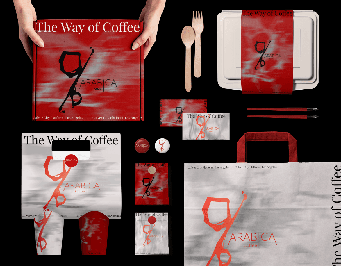
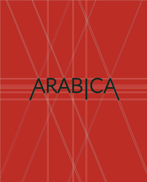
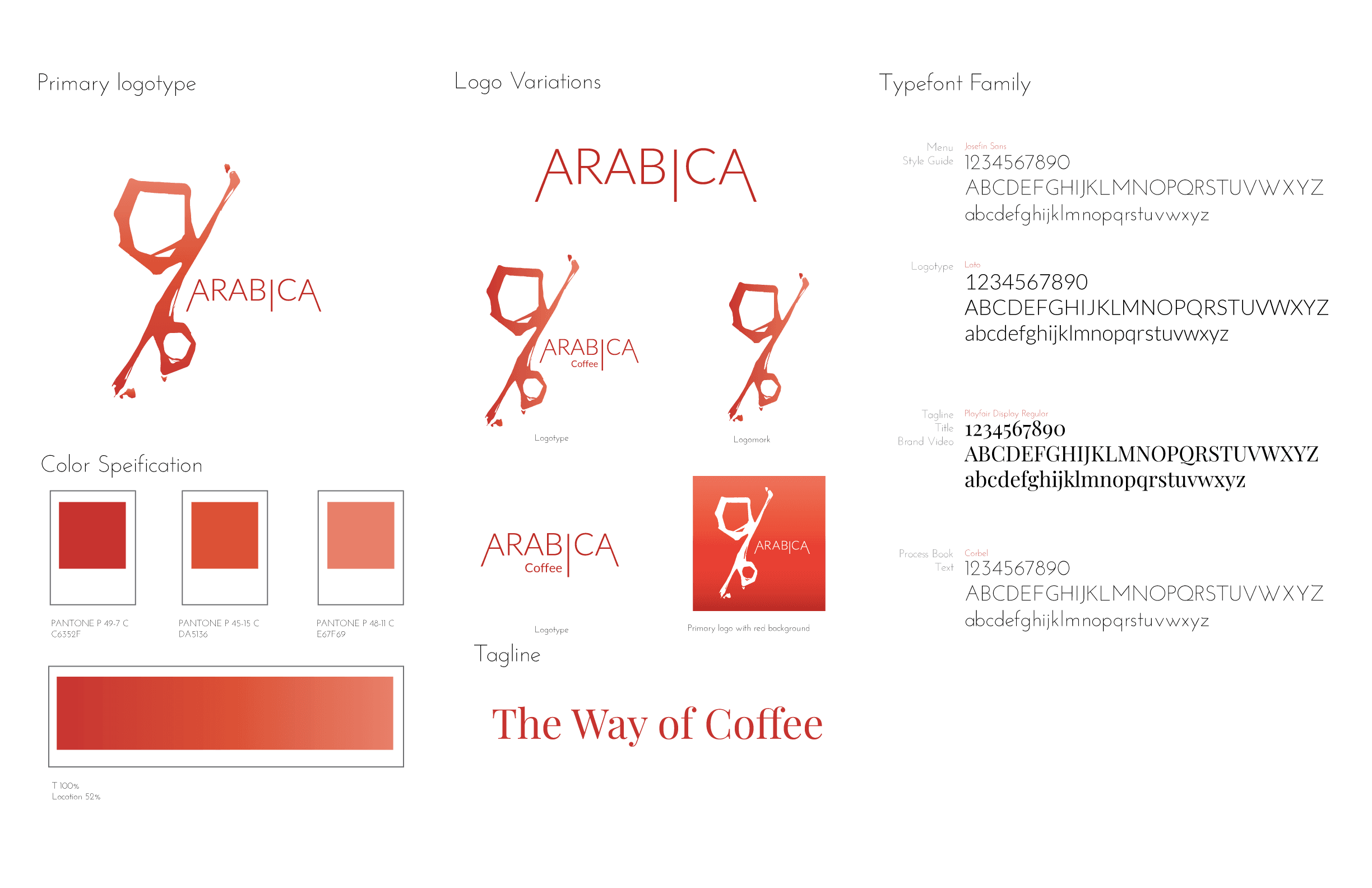
The percentage symbol (%) continues to be the anchor of %Arabica’s logo, now enhanced with bold execution to better align with the vibrant LA market.
Red Integration: The logo’s red backdrop adds energy and draws attention, giving the mark a stronger presence in physical and digital spaces.
Balance and Clarity: The simplicity of the symbol is retained, representing precision, purity, and focus, key tenets of both the brand and the Bushido spirit.


Red as Hero
The visual identity centers around red, a color symbolizing passion, courage, and energy. This bold
palette reflects the Bushido-inspired dedication to craft and the vibrant personality of %Arabica’s
Culver City location.
Primary Color: A deep, confident red (Pantone DA5136), used prominently across all branding
touchpoints.
Accent Colors: Neutral whites, blacks, and subtle grays balance the intensity of red, creating a
refined and modern aesthetic.
Emotional Tone: The bold red energizes the brand, while the neutral tones ground it, ensuring the
design feels impactful yet approachable.


EM-Smart Rebrand: Technology Empowers Connection
2024-2025
Branding
Campaign

Bushido: Coffee Omakase Experience in Culver City
2024
Retail Store Design
Fabrication

Quixotic Journey:A DIESEL Experience
2024
Exhibit Design
Campaign
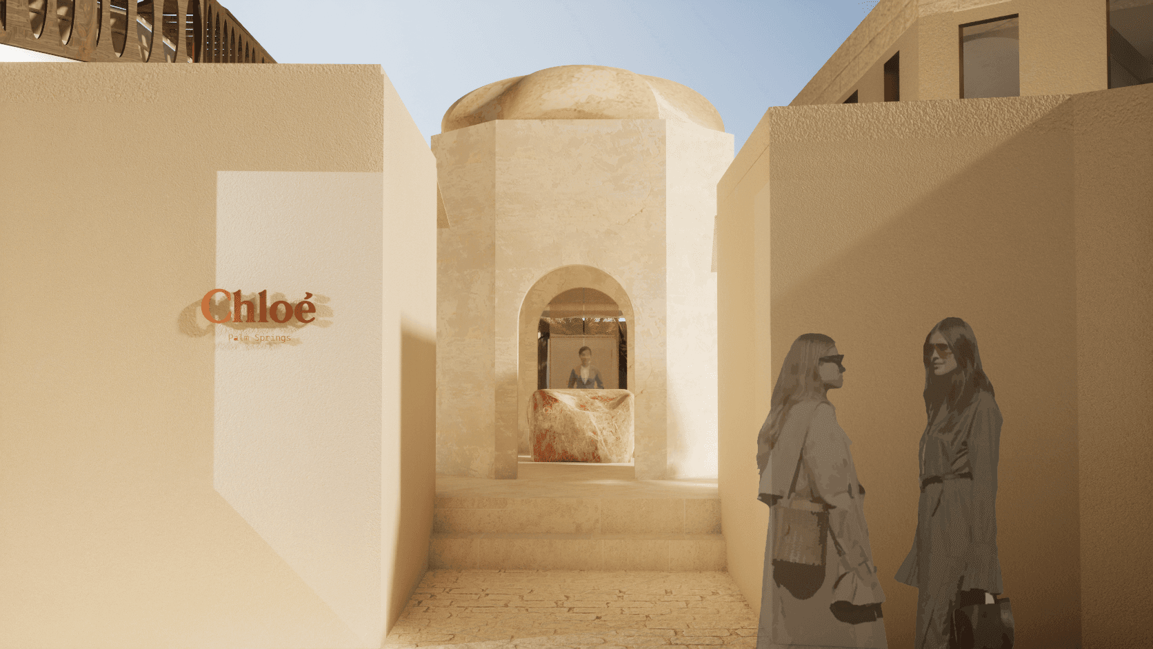
Desert Reneissance
Chloe
Creative Direction
Hotel Design

Mirage+: Reimagination of Outer Space Architecture
2024
Spatial Design
Virtual Experience
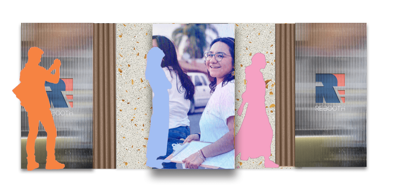
Rebooth: Reimagine the voting experience
2025
Pop-up Design
Fabrication
Bushido: Rebrand %Arabica
For this school project, we were tasked with creating a complete branding and spatial retail design solution for %Arabica’s new coffee shop opening at the Culver City Platform in Los Angeles.
Branding
Creative Direction
Crafting smooth journeys from vision to reality, ensuring every detail aligns with the brand’s heartbeat.®
Bushido: The Way of Coffee
The core challenge was to adapt %Arabica’s minimalist Japanese identity, ensuring it not only resonated with the culturally diverse, design-forward, and fast-paced environment of Culver City, LA, but also embraced and amplified its Japanese roots. While the global brand is synonymous with understated elegance, the LA audience demanded something bolder—an edgy, design-driven approach that reflects the city's dynamic creativity and multicultural energy.
Diving deep into challenges to opportunities
%Arabica needed a rebrand that preserved its premium craftsmanship while creating a more daring, culturally enriched, and hyper-local retail experience. The goal was to establish a space that celebrates Japan’s bold design traditions—combining precision, artistry, and mindfulness—with a modern twist. This new identity needed to elevate the coffee experience, creating a sanctuary that invites creativity, community, and connection in LA’s design-conscious and diverse market.
Willow Studio was created to redefine the way brands communicate through design. Our approach blends creativity, strategy, and functionality to deliver visually stunning and highly effective solutions. We focus on crafting seamless user experiences, ensuring that every design element serves a purpose and enhances brand storytelling. By combining cutting-edge aesthetics with thoughtful execution, we help businesses stand out in a crowded market. From branding and digital experiences to interactive design and storytelling, Willow Studio provides a tailored approach that aligns with each client’s unique vision. Our process prioritizes collaboration, ensuring that every project is a perfect fusion of creativity and business goals.
Audience: Urban Samurai
Sophisticated. Discerning. Mindful.
The Urban Samurai are not just coffee drinkers—they are seekers of meaning and craft. These modern warriors embrace the spirit of excellence in their daily lives, craving spaces where they can pause, reflect, and connect.
Mindful Consumption: They savor each sip, appreciating the craft and origin of their coffee.
Community-Driven: They thrive in environments that foster creativity and connection.
Bold & Edgy: They seek spaces and brands that are distinct, culturally rich, and
unapologetically authentic.
The Spirit of BUSHIDO
Drawing from the philosophy of the samurai, %Arabica embodies:
Mastery & Discipline: Relentless pursuit of excellence in every detail.
Mindfulness & Respect: Deep appreciation for the craft of coffee
and its cultural significance.
Courage to Innovate: Pushing boundaries while staying true to the brand’s roots.
Compassion & Hospitality: Creating spaces where customers
feel valued and connected.
Bold Design, Cultural Depth
The Culver City Platform location redefines the coffee experience by elevating %Arabica’s identity with an edgier, more daring take on Japanese culture.
Traditional Japanese aesthetics are reimagined with modern, striking design cues.
The interior design invites customers to witness the “battle dance” of coffee-making, where baristas perform their craft with samurai-like focus and grace.
Every corner of the space tells a story, from handpicked materials to thoughtfully curated art inspired by Japanese traditions.
Branding
Creative Direction
Timeless Boldness
The percentage symbol (%) continues to be the anchor of %Arabica’s logo, now enhanced with bold execution to better align with the vibrant LA market.
Red Integration: The logo’s red backdrop adds energy and draws attention, giving the mark a stronger presence in physical and digital spaces.
Balance and Clarity: The simplicity of the symbol is retained, representing precision, purity, and focus, key tenets of both the brand and the Bushido spirit.
Red as Hero
The visual identity centers around red, a color symbolizing passion, courage, and energy. This bold
palette reflects the Bushido-inspired dedication to craft and the vibrant personality of %Arabica’s
Culver City location.
Primary Color: A deep, confident red (Pantone DA5136), used prominently across all branding
touchpoints.
Accent Colors: Neutral whites, blacks, and subtle grays balance the intensity of red, creating a
refined and modern aesthetic.
Emotional Tone: The bold red energizes the brand, while the neutral tones ground it, ensuring the
design feels impactful yet approachable.
EM-Smart Rebrand: Technology Empowers Connection
2024-2025
Branding
Campaign
Bushido: Coffee Omakase Experience in Culver City
2024
Retail Store Design
Fabrication
Quixotic Journey:A DIESEL Experience
2024
Exhibit Design
Campaign
Desert Reneissance
Chloe
Creative Direction
Hotel Design
Mirage+: Reimagination of Outer Space Architecture
2024
Spatial Design
Virtual Experience
Rebooth: Reimagine the voting experience
2025
Pop-up Design
Fabrication
Bushido: Rebrand %Arabica
For this school project, we were tasked with creating a complete branding and spatial retail design solution for %Arabica’s new coffee shop opening at the Culver City Platform in Los Angeles.
Branding
Creative Direction
Crafting smooth journeys from vision to reality, ensuring every detail aligns with the brand’s heartbeat.®
Bushido: The Way of Coffee
The core challenge was to adapt %Arabica’s minimalist Japanese identity, ensuring it not only resonated with the culturally diverse, design-forward, and fast-paced environment of Culver City, LA, but also embraced and amplified its Japanese roots. While the global brand is synonymous with understated elegance, the LA audience demanded something bolder—an edgy, design-driven approach that reflects the city's dynamic creativity and multicultural energy.
Diving deep into challenges to opportunities
%Arabica needed a rebrand that preserved its premium craftsmanship while creating a more daring, culturally enriched, and hyper-local retail experience. The goal was to establish a space that celebrates Japan’s bold design traditions—combining precision, artistry, and mindfulness—with a modern twist. This new identity needed to elevate the coffee experience, creating a sanctuary that invites creativity, community, and connection in LA’s design-conscious and diverse market.
Willow Studio was created to redefine the way brands communicate through design. Our approach blends creativity, strategy, and functionality to deliver visually stunning and highly effective solutions. We focus on crafting seamless user experiences, ensuring that every design element serves a purpose and enhances brand storytelling. By combining cutting-edge aesthetics with thoughtful execution, we help businesses stand out in a crowded market. From branding and digital experiences to interactive design and storytelling, Willow Studio provides a tailored approach that aligns with each client’s unique vision. Our process prioritizes collaboration, ensuring that every project is a perfect fusion of creativity and business goals.
Audience: Urban Samurai
Sophisticated. Discerning. Mindful.
The Urban Samurai are not just coffee drinkers—they are seekers of meaning and craft. These modern warriors embrace the spirit of excellence in their daily lives, craving spaces where they can pause, reflect, and connect.
Mindful Consumption: They savor each sip, appreciating the craft and origin of their coffee.
Community-Driven: They thrive in environments that foster creativity and connection.
Bold & Edgy: They seek spaces and brands that are distinct, culturally rich, and
unapologetically authentic.
The Spirit of BUSHIDO
Drawing from the philosophy of the samurai, %Arabica embodies:
Mastery & Discipline: Relentless pursuit of excellence in every detail.
Mindfulness & Respect: Deep appreciation for the craft of coffee
and its cultural significance.
Courage to Innovate: Pushing boundaries while staying true to the brand’s roots.
Compassion & Hospitality: Creating spaces where customers
feel valued and connected.
Bold Design, Cultural Depth
The Culver City Platform location redefines the coffee experience by elevating %Arabica’s identity with an edgier, more daring take on Japanese culture.
Traditional Japanese aesthetics are reimagined with modern, striking design cues.
The interior design invites customers to witness the “battle dance” of coffee-making, where baristas perform their craft with samurai-like focus and grace.
Every corner of the space tells a story, from handpicked materials to thoughtfully curated art inspired by Japanese traditions.
Branding
Creative Direction
Timeless Boldness
The percentage symbol (%) continues to be the anchor of %Arabica’s logo, now enhanced with bold execution to better align with the vibrant LA market.
Red Integration: The logo’s red backdrop adds energy and draws attention, giving the mark a stronger presence in physical and digital spaces.
Balance and Clarity: The simplicity of the symbol is retained, representing precision, purity, and focus, key tenets of both the brand and the Bushido spirit.
Red as Hero
The visual identity centers around red, a color symbolizing passion, courage, and energy. This bold
palette reflects the Bushido-inspired dedication to craft and the vibrant personality of %Arabica’s
Culver City location.
Primary Color: A deep, confident red (Pantone DA5136), used prominently across all branding
touchpoints.
Accent Colors: Neutral whites, blacks, and subtle grays balance the intensity of red, creating a
refined and modern aesthetic.
Emotional Tone: The bold red energizes the brand, while the neutral tones ground it, ensuring the
design feels impactful yet approachable.
©2024
EM-Smart Rebrand: Technology Empowers Connection
2024-2025
Branding
Bushido: Coffee Omakase Experience in Culver City
2024
Retail Store Design
Quixotic Journey:A DIESEL Experience
2024
Exhibit Design
Desert Reneissance
Chloe
Creative Direction
Mirage+: Reimagination of Outer Space Architecture
2024
Spatial Design
Rebooth: Reimagine the voting experience
2025
Pop-up Design